By: Izzy Cheung, Staff Writer and Michelle Young, Opinions Editor
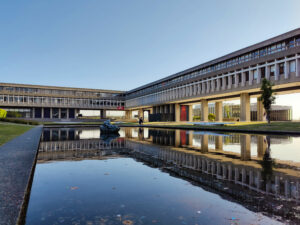
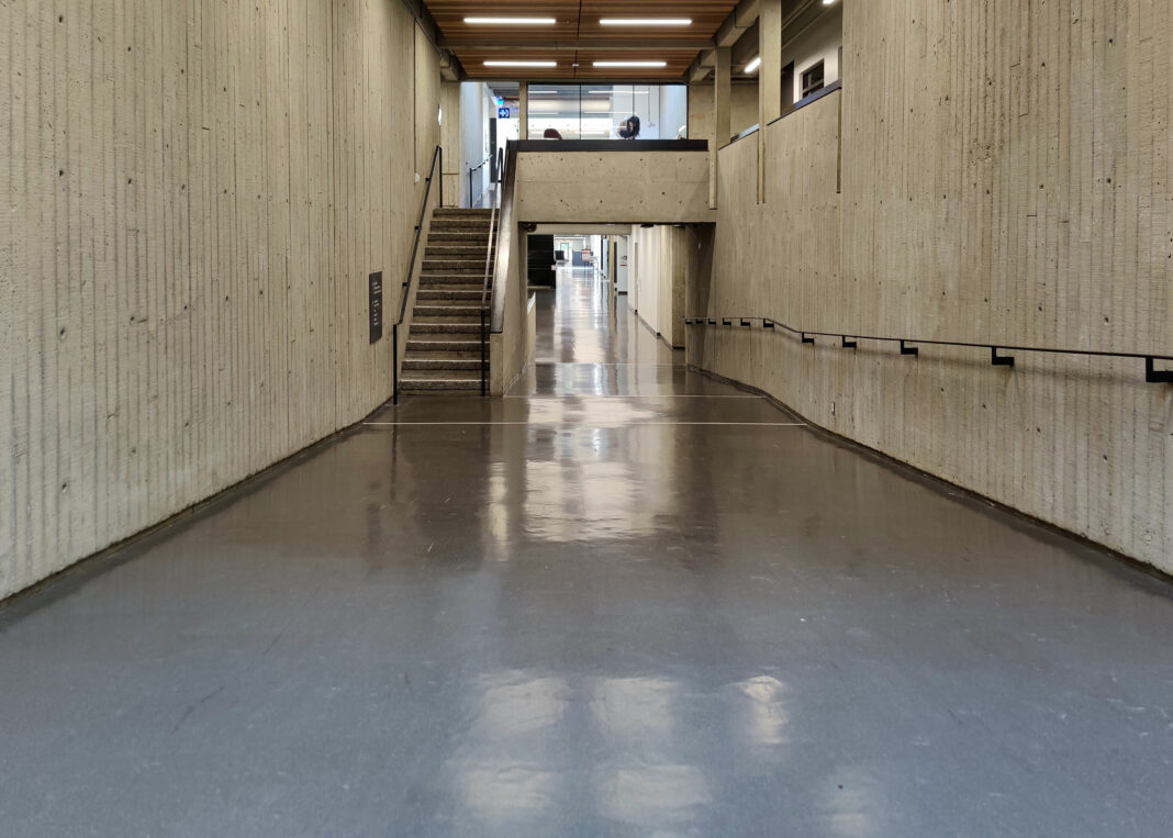
SFU has a reputation for looking like a grey concrete prison. Many students argue the aesthetics on campus are demoralizing. However, in recent years, more conversations have emerged around SFU’s beautiful views and wildlife. President Joy Johnson noted the “design for Burnaby campus shaped SFU’s educational philosophy by tearing down walls between faculties, removing silos, and creating common areas where disciplines merge and ideas flourish.” So, is SFU’s poor architectural reputation justified?
Izzy: I can understand some things about the Burnaby campus are nice, like Burnaby Mountain sunsets. However, I’ve had most of my classes take place at Harbour Centre, and the location has made a huge difference.
For starters, SFU Burnaby is so inconvenient. It’s literally on top of a mountain, meaning the only spots near the university are the things located on campus. Everything else requires a 10–15 minute transit or drive. Things are so much more convenient when I have my classes at Harbour Centre, especially since it’s located right in front of Waterfront Station. In terms of food, there are so many options to choose from at Harbour Centre, and if none of them are to your liking, all you need to do to find more options is walk a couple of blocks. Arriving at Waterfront brings you to Starbucks, Jugo Juice, Chronic Tacos, A&W, and Body Energy Club — and that’s just inside the station. If you’ve got time between classes, you can head up a little ways to Robson Street, or follow West Cordova street down to Gastown.
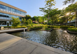
Michelle: I’m not going to argue that SFU Burnaby is super convenient, but a 10–15 minute transit ride or drive is preferable for me since walking a few blocks can trigger chronic pain. Sometimes even just walking to classes can be a lot, and that’s my least favourite aspect of the Burnaby campus. Burnaby Mountain isn’t particularly close to anything either, so I do get where you’re coming from. Harbour Centre has the best food, I’ll give it that. Once I accepted the fact I’ll be stuck on campus most of the time, though, I found it’s not as bad as people make it out to be. The Burnaby library is huge, and I’ve been able to find lots of books I wouldn’t have been able to read otherwise. The complaints about SFU’s architecture and aesthetics are overblown. I think the campus has lots of cute spots. The glass and wood accents in Saywell Hall allow light to peek in and the tables there are cozy. I also love walking across the koi pond and trying to sneak a glance at the fish. The greenery around SFU Burnaby is somewhat typical for BC, but it makes the campus feel nice and calm.

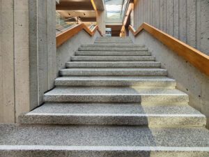
Izzy: I’ll agree with your points on some of SFU Burnaby’s architecture, particularly with Saywell Hall — that’s probably my favourite spot on campus aesthetically speaking. I do like sitting in that little courtyard area between Saywell and Blusson when it’s nice out. In terms of natural views, I’d wholeheartedly agree that SFU Burnaby is better than the other campuses. My main concern with the architecture part isn’t really the aesthetics, but more-so the actual construction of the campus itself. Why are there so many stairs?

I’m coming from the standpoint of someone who dislikes stairs, so I can’t even begin to imagine how much of a pain this campus must be for those who aren’t able to use them. Looking at the map, the entire Academic Quadrangle has only two elevators. Granted, there are some in West Mall and Saywell, but in terms of accessibility, SFU’s designers didn’t quite think through the construction thoroughly. For myself, I don’t particularly enjoy huffing it up from the transit exchange between West Mall and the library, as most of the time, this results in me showing up to class soaking wet from the rain and gasping for breath. I guess the aspect of wide campuses could be applied to all big universities, but it’s still something to think about. In terms of accessibility and convenience, I feel like the multi-floor, corporate-styled building is the way to go — even if it’s not stylistically preferred.

Michelle: Oh, the Djavad Mowafaghian Courtyard is very pretty! SFU’s design has commonly been referred to as brutalist, which was a popular style in the ‘50s and ‘60s. However, Donald Luxton, an architect and historical writer, disagrees with this assessment as the design’s “use of concrete was finely detailed and not in line with brutalist trends of the mid-20th century.” I personally love the grey concrete aesthetics, since they feel very Tadao Ando-esque, whose structures are associated with minimalist architecture and empty space. His work is still considered to be modern and appealing today.
Overall, though, I do think the Burnaby campus is a little too spread out. And there could have been some better choices made for accessibility. Perhaps the conversation around SFU looking like a prison and being “glum” has distracted from real on-campus problems.

Maybe we shouldn’t be discussing whether or not we like the visuals of SFU, but rather, whether the structure is serving us well. One of the SFU architects, Geoffrey Massey, studied under the Bauhaus movement, where function is an important aspect of design, too.
Izzy: Agree! Each campus has its positives and negatives, and those traits are defined as such depending on what each person thinks and experiences. Either way, if possible, everyone should try visiting the other campuses at least once so they can broaden their perspectives in terms of what they think works best for SFU’s architecture.


